2.1 Undertake Research for an Assignment or Project
Jessica RobinsonPrimary Research.
Similar Magazines/Publications:
task 6
Empire - November 2011:
What does the cover look like?
 The cover has the title of the magazine in big and bold red writing, this will help catch the attention of the potential reader it could help evoke the initial interest in buying the magazine for the potential reader. It also has the whole front page covered in the feature film The Girl In The Dragon Tattoo, it shows you what's going to be inside the magazine straightway its very to the point. The reader of the magazine will know exactly what they are getting when seeing this cover picture. I think that the cover of empire looks very intriguing the neon pink stands out from the dark background it creates an alluring cover that I would be drawn to if I personally saw it in the shops. However I think that to improve the cover they should have put some smaller less propionate images on the front, of the other topics and films that are covered in the magazine, this is because if you were not interested in The Girl With The Dragon Tattoo, I do not believe that someone would be drawn to pick up the magazine to see what's inside. As it looks like the magazine is predominately focussed on The Girl With The Dragon Tattoo.
What is the feature on the cover page?
The feature on the front cover is The Girl With The Dragon Tattoo. It has bold white and neon pink font across the front that contrasts the dark background, it makes the writing pop and it helps draw you into wanting to read it. Moreover, the image is elusive and doesn't reveal much about the film. Therefor it evokes a seance of curiosity making the potential buyer want to read the magazine more.
Does It Have A Centre Page Spread?
This copy of empire has a center page spread covering Steven Spielberg on a two-part journey into his filmmaking future. It seems to be focussing mostly on his film Tintin. To improve this I would try and focus on some films other than tin-tin as the target audience for empire is 16 - 30 years old and the majority of people seeing the cartoon film will be younger than this age range. I believe that some of Spielberg's movies such as Jaws or Jurassic World would be more appropriate for the target demographic.
Does It Have Interviews?
Empire has multiple interviews within it mostly with directors and actors.
Contents For Readers?
Empire has detailed contents telling the readers the title of what's on each page and a brief description of the content of the page. It also has big pictures in an almost collage style with the page number on them that they relate to. I believe this will help intrigue the readers and help spark an invest for the topics being covered in the magazine. I think the content could be made slightly more organized as it is slightly all over the place, there is a slight lack of structure which could be confusing to the potential reader.
Film Reviews?
Empire has multiple film reviews in it ranging from whats in the cinema currently and fils that are out on DVD and blue ray. Empire also features reviews on things such as TV shows and games. This helps them, reach a wider audience other than people interested in films.
Empire vs Total Film:
Initially, from the front cover, they look like the magazines are targeted at very different audiences. Empire has used a dark color scheme contrasted with bright pink and blue text to make the writing stand out from the picture in the back. Ware as Total Film uses much more soft colors and less harsh colors of fonts on the front, it looks like it is targeted more towards women as posed to empire which I think looks like it may be aimed more at men. Empire has a center page spread but Total Film does not. Personally, I find the idea of magazines having a center page spread appealing, this is because it gives a more structured look of the magazine, as it gives the magazine something to be focussed and centered around. However, I think that Total Film has a much more structured content page than Empire. It has subcategories with page numbers beneath them, the subcategory will be a general theme or topic for whats in that section. I find it much more easy to navigate than the empire magazine content. Both the magazines have reviews which I think are detailed and well structured.
Neo - issue 169:
What does the cover look like?
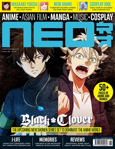
The cover has a bright blue and bold title font. It contrasts the dark colored background. The title of the magazine pops off the front of the page making it stand out, they have also used bright neon yellow on details they wish to highlight, this makes them stand out and seem important it helps draw the potential buyer in, it makes them want to read the highlighted sections as they seem important. Moreover, the front cover is centered around the two main characters and from Black Clover. Black Clover is in a white almost gothic font which is the font used in the anime its self. Readers who are interested in though anime will recognize the characters along with the title and font, I believe they will be inclined to buy it. Furthermore, at the top in a less bold white font, it tells you what is in the magazine withoutout useing huge images that will distract you from the main image on the front cover. I think that it is in a more minimalist style and this would appeal to readers as it does not look hectic or confused. To improve it I would make the yellow parts of the magzine a bright blue colour, not the same as the title but still blue, this is because I think that although the yellow helps it stand out blue will help it have a more cohesive theme and still highlight the important information that the creator of the magazine wanted the potential buyer to read.
What is the feature on the cover page?
The feature on the front cover of the magazine is the two main characters from Black Clover. The characters seem to contrast one another, the one on the left has dark hair and dark blue themed clothing however the boy character on the right has a more lighter theme to his clothing, it has more burgundy colours in it with light blonde hair. I think that if I were to make improvements I would do a contact in the background as well to help the characters pop more off the page.
What does Neo consist of?
Neo focuses on anime, manga, asian film, life style, games and competitions. It has reviews and some interviews with in it. Not only does it review anime films and series, but it reviews all things related to anime with in life style. Weather it be games, card games, figures or anime memorabilia they cover it. However they seem to focus more on anime series weather then films, so i believe there is a gap in the market for my magazine as it is only going to cover films.
task 9
Questionnaire:
1. What kind of front cover draws you towards a magazine?
2. Do you think interviews with directors of films are interesting?
3. Do you think subjects of the magazines should cover new premiering films or older films?
4. Are you interested in reading about the actors as well as the actual film its self?
5. What kind of content do you look for in film magazines?
6. What genre of film are you most interested in?
7. Would you be more inclined to bye a magazine if it was dark or brightly coloured?
8. How much would you expect to pay for your average film magazine?
9. Would you prefer an online copy of the magazine?
10. Are you interested in live theatre productions?
task 7 and 8
1) It was a large majority of people who took my questionnaire who all said that brightly coloured magazines with bold texts and lots of pictures is what draws people to buy a certain magazine. Another thing that seem to draw people in to buy magazines is weather it has an attractive actor on the front cover and that the cover should relate to what is in the magazine. This tells me that in my magazine I must include brightly coloured text with lots of images, seeing as my magazine if focussing on anime and manga style films I will make sure that they are mostly brightly coloured images from the films that are relevant to the information that is in the magazine.
3) The results show me that I must include both old and new anime style films as a large majority of people voted for both old classics and new premieres. However more people voted for new films than old ones so I will try to focus my main article on a new movie that has come out this year. However when it come to anime the majority of films that come out are in Japanese, therefor, there is a limited amount of premiering anime films that I could focus on so I would still have have to put a lot of old films into my magazine. To make them interesting I will make sure the films that are included have a new spin on them so that the reader will stay intrigued.

4) Most people voted that they are interested in the actors as well as the film. So this means that I will definitely do features on the voice actor behind the characters in the anime films. A small percentage said no and sometimes. I think this is because in anime films you do not see the voice actors so there for they may not be interested. So I may only do this feature on larger more popular anime. To keep the reader engaged I could ask them questions on how they feel about there characters and what affinities they believe they have with them.

5)
7) This pie chart shows me that I need to use bright colours and with a mixture of dark accents on the front cover of the magazine. I will probably make the front cover very alureing and bright to capture the attention of buyers. People usefully associate colour with emotion. So I must use colours that will evoke a positive emotion to do with my magazine. Pastel colours are very popular in anime movies so I could do a mixture of bright and pastel colours, to create my front cover.

8) The price range that people expect to pay for a film magazine is between £1 and £5, so using this data I would probably price my magazine around £2.50 as it is not to expensive and fits in with the range of answers I got from my questionnaire. I think that this is an affordable price for all types of people who wish to buy magazines.
9) This shows me people want a more easily accessible magazine. I may look into a way of doing this as it massively reduces production costs as you do not need to print copies. People would be able to download portable copies that they can carry around everywhere with them. It is also far more eco-friendly as it is not wasting paper and killing trees for the production.


task 6
Internet Research:
When researching anime magazines that are published in the UK I could only find 5 publications. The first one was Anime UK which was published monthly from 1991 to 1996, next there is Manga artist which was started to be published in 2014 it is annual and is still being published to this day, another one is is Manga Mover which was published once in 2004, then there is MYM which has been published monthly from 2002 and finally there is Neo which has been published monthly since 2004. So currently there are only 3 anime/manga magazines that are being published in the UK. Manga artist discuses the art of manga and the manga industry, MYM discusses Japanese pop culture and Neo focuses of reviews of animes and Japanese pop culture updates. None of the magazines that are currently out in the UK focus solely on anime and manga style films, this means that there is a gap in the market for an anime magazine that only focuses on films and film reviews.
Production costs & ware it is sold:
Using https://mixam.co.uk/magazines, to print 100 copes of an eight page magazine with a front cover and gloss finnish it will cost from £80.50 (slower shipping) to £112.50 (express shipping). This also includes colour on all the pages, a portrait style and stapes for the binding of the magazine. My magazine could be sold in local retailers such as corner shops and local book stores. You could also sell online versions which you can download on to your phone or tablet. This would reduce the production cost dramatically as there would be no need to print copies and have them sent off. Also they are more convenient for the buyer/reader.
task 2 My Magazine:
Summery/Synopsis:
My magazine is focussed on anime and manga style films. Anime has a very wide reach from very young audiences to older more mature audiences it can appeal to both men and women it is a very versatile genre. That is why the target audience is from 12 years old to 25 years old. My magazine: Cute Film, is going to include a main review on a new premiering film, with interviews, pictures and a how to draw your favourite character section, it could also be a colouring in section to appeal to the younger section of my target audience. This is because it is something fun and interactive that the readers can engage with. Also, a huge part of anime is the drawing and animation, many people are very intrigued in how to draw in that style. Furthermore, I am going to also focus on other anime films that may not necessarily be new or premiering. This is because anime is not the most popular style of film so there are not many new ones released every year that are translated in to english for the audience from the UK. I will include in depth interviews with animators and the voice actors. The purpose of my magazine is to inform the readers of all things anime, I want my readers to enjoy them self while reading it and I want it to have an engaging layout that isn't the same as every other magazine.
task 3
FRONT COVER:


Bibliography:
Does It Have A Centre Page Spread?
This copy of empire has a center page spread covering Steven Spielberg on a two-part journey into his filmmaking future. It seems to be focussing mostly on his film Tintin. To improve this I would try and focus on some films other than tin-tin as the target audience for empire is 16 - 30 years old and the majority of people seeing the cartoon film will be younger than this age range. I believe that some of Spielberg's movies such as Jaws or Jurassic World would be more appropriate for the target demographic.
Does It Have Interviews?
Empire has multiple interviews within it mostly with directors and actors.
Contents For Readers?
Empire has detailed contents telling the readers the title of what's on each page and a brief description of the content of the page. It also has big pictures in an almost collage style with the page number on them that they relate to. I believe this will help intrigue the readers and help spark an invest for the topics being covered in the magazine. I think the content could be made slightly more organized as it is slightly all over the place, there is a slight lack of structure which could be confusing to the potential reader.
Film Reviews?
Empire has multiple film reviews in it ranging from whats in the cinema currently and fils that are out on DVD and blue ray. Empire also features reviews on things such as TV shows and games. This helps them, reach a wider audience other than people interested in films.
Empire vs Total Film:
Initially, from the front cover, they look like the magazines are targeted at very different audiences. Empire has used a dark color scheme contrasted with bright pink and blue text to make the writing stand out from the picture in the back. Ware as Total Film uses much more soft colors and less harsh colors of fonts on the front, it looks like it is targeted more towards women as posed to empire which I think looks like it may be aimed more at men. Empire has a center page spread but Total Film does not. Personally, I find the idea of magazines having a center page spread appealing, this is because it gives a more structured look of the magazine, as it gives the magazine something to be focussed and centered around. However, I think that Total Film has a much more structured content page than Empire. It has subcategories with page numbers beneath them, the subcategory will be a general theme or topic for whats in that section. I find it much more easy to navigate than the empire magazine content. Both the magazines have reviews which I think are detailed and well structured.
Neo - issue 169:
What does the cover look like?
The cover has a bright blue and bold title font. It contrasts the dark colored background. The title of the magazine pops off the front of the page making it stand out, they have also used bright neon yellow on details they wish to highlight, this makes them stand out and seem important it helps draw the potential buyer in, it makes them want to read the highlighted sections as they seem important. Moreover, the front cover is centered around the two main characters and from Black Clover. Black Clover is in a white almost gothic font which is the font used in the anime its self. Readers who are interested in though anime will recognize the characters along with the title and font, I believe they will be inclined to buy it. Furthermore, at the top in a less bold white font, it tells you what is in the magazine withoutout useing huge images that will distract you from the main image on the front cover. I think that it is in a more minimalist style and this would appeal to readers as it does not look hectic or confused. To improve it I would make the yellow parts of the magzine a bright blue colour, not the same as the title but still blue, this is because I think that although the yellow helps it stand out blue will help it have a more cohesive theme and still highlight the important information that the creator of the magazine wanted the potential buyer to read.
What is the feature on the cover page?
The feature on the front cover of the magazine is the two main characters from Black Clover. The characters seem to contrast one another, the one on the left has dark hair and dark blue themed clothing however the boy character on the right has a more lighter theme to his clothing, it has more burgundy colours in it with light blonde hair. I think that if I were to make improvements I would do a contact in the background as well to help the characters pop more off the page.
What does Neo consist of?
Neo focuses on anime, manga, asian film, life style, games and competitions. It has reviews and some interviews with in it. Not only does it review anime films and series, but it reviews all things related to anime with in life style. Weather it be games, card games, figures or anime memorabilia they cover it. However they seem to focus more on anime series weather then films, so i believe there is a gap in the market for my magazine as it is only going to cover films.
task 9
Questionnaire:
1. What kind of front cover draws you towards a magazine?
2. Do you think interviews with directors of films are interesting?
3. Do you think subjects of the magazines should cover new premiering films or older films?
4. Are you interested in reading about the actors as well as the actual film its self?
5. What kind of content do you look for in film magazines?
6. What genre of film are you most interested in?
7. Would you be more inclined to bye a magazine if it was dark or brightly coloured?
8. How much would you expect to pay for your average film magazine?
9. Would you prefer an online copy of the magazine?
10. Are you interested in live theatre productions?
task 7 and 8
Questioner Analysis:
1) It was a large majority of people who took my questionnaire who all said that brightly coloured magazines with bold texts and lots of pictures is what draws people to buy a certain magazine. Another thing that seem to draw people in to buy magazines is weather it has an attractive actor on the front cover and that the cover should relate to what is in the magazine. This tells me that in my magazine I must include brightly coloured text with lots of images, seeing as my magazine if focussing on anime and manga style films I will make sure that they are mostly brightly coloured images from the films that are relevant to the information that is in the magazine.
2) These result show me that the majority of people enjoy interview with directors so I will make sure to include at least one in my magazine. However two people also said sometimes they enjoy interviews and sometimes they do not, so this means that I must make the interview and fast paced and interesting. This may result in me doing a new style or layout of interview that helps intrigue readers, I could potentially ask off guard and abstract questions that have not been asked before.


3) The results show me that I must include both old and new anime style films as a large majority of people voted for both old classics and new premieres. However more people voted for new films than old ones so I will try to focus my main article on a new movie that has come out this year. However when it come to anime the majority of films that come out are in Japanese, therefor, there is a limited amount of premiering anime films that I could focus on so I would still have have to put a lot of old films into my magazine. To make them interesting I will make sure the films that are included have a new spin on them so that the reader will stay intrigued.

4) Most people voted that they are interested in the actors as well as the film. So this means that I will definitely do features on the voice actor behind the characters in the anime films. A small percentage said no and sometimes. I think this is because in anime films you do not see the voice actors so there for they may not be interested. So I may only do this feature on larger more popular anime. To keep the reader engaged I could ask them questions on how they feel about there characters and what affinities they believe they have with them.

5)
- What the film magazine is about
-Interviews
-Behind the scenes
-Reviews
-Previews
-In depth coverage
This gives me an idea about what people want to see with in my magazine. I will insure to include all of these features as I also desire these things in a film magazine in order to consider buying it. For the behind the scenes section I could do a how to draw your favourite character page as something fun and interactive.
6) This bar graph shows me that the three most popular genres of movies action, sci fi and drama. This shows me that I should ensure that I do at least one feature on each of these genres of films. Maybe do a competition or an interactive page to do with this genre of film. In regards to the other genres I may still feature them but not just as heavily as the others. However I have decided to focus on films that I believe are popular as I only asked a small group of people who may not be interested in or know about anime films as it is not the most popular style of film in the western world.


7) This pie chart shows me that I need to use bright colours and with a mixture of dark accents on the front cover of the magazine. I will probably make the front cover very alureing and bright to capture the attention of buyers. People usefully associate colour with emotion. So I must use colours that will evoke a positive emotion to do with my magazine. Pastel colours are very popular in anime movies so I could do a mixture of bright and pastel colours, to create my front cover.

8) The price range that people expect to pay for a film magazine is between £1 and £5, so using this data I would probably price my magazine around £2.50 as it is not to expensive and fits in with the range of answers I got from my questionnaire. I think that this is an affordable price for all types of people who wish to buy magazines.
9) This shows me people want a more easily accessible magazine. I may look into a way of doing this as it massively reduces production costs as you do not need to print copies. People would be able to download portable copies that they can carry around everywhere with them. It is also far more eco-friendly as it is not wasting paper and killing trees for the production.

10) As the vote came to half and half I do not believe that there is enough people who are interested in live theatre productions. So I will not be focussing on them or featuring them in the magazine. I do not believe that it would bring the magazine any traction. Furthermore, the direction I have decided to take my magazine in I do not believe that having a live production section will be necessary.

task 6
Internet Research:
When researching anime magazines that are published in the UK I could only find 5 publications. The first one was Anime UK which was published monthly from 1991 to 1996, next there is Manga artist which was started to be published in 2014 it is annual and is still being published to this day, another one is is Manga Mover which was published once in 2004, then there is MYM which has been published monthly from 2002 and finally there is Neo which has been published monthly since 2004. So currently there are only 3 anime/manga magazines that are being published in the UK. Manga artist discuses the art of manga and the manga industry, MYM discusses Japanese pop culture and Neo focuses of reviews of animes and Japanese pop culture updates. None of the magazines that are currently out in the UK focus solely on anime and manga style films, this means that there is a gap in the market for an anime magazine that only focuses on films and film reviews.
Production costs & ware it is sold:
Using https://mixam.co.uk/magazines, to print 100 copes of an eight page magazine with a front cover and gloss finnish it will cost from £80.50 (slower shipping) to £112.50 (express shipping). This also includes colour on all the pages, a portrait style and stapes for the binding of the magazine. My magazine could be sold in local retailers such as corner shops and local book stores. You could also sell online versions which you can download on to your phone or tablet. This would reduce the production cost dramatically as there would be no need to print copies and have them sent off. Also they are more convenient for the buyer/reader.
task 2 My Magazine:
Summery/Synopsis:
My magazine is focussed on anime and manga style films. Anime has a very wide reach from very young audiences to older more mature audiences it can appeal to both men and women it is a very versatile genre. That is why the target audience is from 12 years old to 25 years old. My magazine: Cute Film, is going to include a main review on a new premiering film, with interviews, pictures and a how to draw your favourite character section, it could also be a colouring in section to appeal to the younger section of my target audience. This is because it is something fun and interactive that the readers can engage with. Also, a huge part of anime is the drawing and animation, many people are very intrigued in how to draw in that style. Furthermore, I am going to also focus on other anime films that may not necessarily be new or premiering. This is because anime is not the most popular style of film so there are not many new ones released every year that are translated in to english for the audience from the UK. I will include in depth interviews with animators and the voice actors. The purpose of my magazine is to inform the readers of all things anime, I want my readers to enjoy them self while reading it and I want it to have an engaging layout that isn't the same as every other magazine.
task 3
FRONT COVER:

task 4
CONTENTS PAGE:

task 5
ARTICLES:


Bibliography:
- na. (2011). the girl with the dragon tattoo: empire magazine November 2011. Available: https://film-book.com/the-girl-with-the-dragon-tattoo-empire-magazine-november-2011-photos-article/. Last accessed na.
- na. (na). Who is the target audience for these magazines. Available: https://prezi.com/otgt-os0dx__/who-is-the-target-audience-for-these-magazines/. Last accessed na.
- na. (2018). list of magazines published outside of Japan. Available: https://en.wikipedia.org/wiki/List_of_manga_magazines_published_outside_of_Japan. Last accessed 10-10-18.
- na. (2018). anime and manga news and reviews. Available: http://www.neomag.co.uk/sec/home/1/review. Last accessed 10-10-18.
- NA. (2018). Howl's Moving Castle. Available: https://en.wikipedia.org/wiki/Howl%27s_Moving_Castle_(film). Last accessed 16-10-18.
- Joe Strike. (2005). Howls moving castle a work of modern art. Available: https://www.awn.com/animationworld/howl-s-moving-castle-work-modern-art. Last accessed 17-10-18.
- Peter Bradshaw. (na). Mary and the witches flower review. Available: https://www.theguardian.com/film/2018/may/03/mary-and-the-witchs-flower-review-japanese-animation-hiromasa-yonebayashi. Last accessed 17-10-18.
Unit 2 Assignment 2.2
Final Copy
Anime and manga is a style of Japanese film and television animation, typically aimed at adults as well as children. It has a very large following in Japan, China and Korea but has also a rather large following in westernised culture. However, people in the UK have a very small amount of magazines that are published regularly that address anime and manga style films. I want to be able to fill this gap in the market.
My film magazines purpose is to inform and entertain people who are interested in Japanese culture as well as anime and manga films. I also want my magazine to go into depth on the origins of anime films as well as in depth interviews with the animators and directors. This would be to show to readers a new perspective on their favourite anime and manga style films. The graph below shows that people think interviews with directors are interesting, so this is another reason that makes me want to include them in my magazine.

The purpose is also to fill the gap in the market for an anime film magazine, this is because there are only 5 anime magazine companies that have been published, only 3 of these are currently being published still to this day. Furthermore, I found out from some of my initial online research that none of these magazines solely focus on anime films so this magazine has a certain unique selling point.


 My target demographic is from 12 years old to 25 years old, this is because anime films are mostly targeted towards younger audiences, however, there are also many anime films that include very dark themes that could be targeted to an older demographic. This is why I have decided that my target audience is from 12 years old to 25 years old. I found out from online research that anime is subjective. This is because there are so many different genres and styles so it could suit anybody's desires. This is why I have given such a broad age gap for who my film magazine is targeted towards. Moreover when doing some initial research I found that all different genres are very popular and that's why I am not making my magazine genre specific and also means my magazine should have a large age gap as not all genres are suitable for all age groups. Below is a graph that show what genres people are interested in:


The purpose is also to fill the gap in the market for an anime film magazine, this is because there are only 5 anime magazine companies that have been published, only 3 of these are currently being published still to this day. Furthermore, I found out from some of my initial online research that none of these magazines solely focus on anime films so this magazine has a certain unique selling point.


Using https://mixam.co.uk/magazines, to print 100 copies of an eight page magazine with a front cover and gloss finish it will cost from £80.50 (slower shipping) to £112.50 (express shipping). This also includes colour on all the pages, a portrait style and staples for the binding of the magazine. Due to the fact that you can upload all the content from your laptop using the software on the website there is no need for a huge production crew as all you need is a writer and someone to upload the articles and the images onto the website.
My magazine could be sold in local retailers such as corner shops as well as book stores such as WHSmith and Waterstones. This is because I want my magazine to be accessible for everyone, whether that be at the shop at the top of your road or if someone wanted to pick it up at an average shop that you could find on the high street. I would also want to sell online versions which you can download on to your phone or tablet. This would reduce the production cost dramatically as there would be no need to print copies and have them sent off. Also, they are more convenient and easily accessible for the buyer/reader. Another positive of using a digital download is that it is more economically friendly as it is not using paper.

Below is a graph that shows that people would like an online copy:

The production cost for my magazine with slower shipping and 100 copies would altogether be £80.50. This would mean that to make a profit I would have to price my magazine at, at least £1 each if I did this I would make £100 in revenue but only £19.50 profit. I would want to make more profit than £19.50 so I would place my magazine at a higher price. From some initial research I did, I found out that most people would want to pay between £1 and £5. Therefore, I would price my magazine at £3. This would mean that I would make £300 revenue and £219.5 profit for selling 100 copies of my magazine.
I have decided that my magazine will be coming out monthly. This is because it means that I would be able to keep regular buyers engaged by the idea that they will get content often enough that they will stay in the loop of the magazine but they will not be being bombarded with too many copies that they will get bored and no longer want to keep on buying it.
To conclude the main purpose of my anime film magazine is to fill the gap in the UK market and to give an in-depth look into anime and manga style films. I would sell it for £3 as it would make a decent profit as well as being a price that I believe people will be willing to pay. I would distribute it in corner shops as well as book shops to try and reach as wide an audience as possible. It would feature all different genres to be able to satisfy every reader's interest. I want my magazine to be easily accessible hence why I believe an online copy would be a lower cost, more eco-friendly and more convenient option. However, if this was an option that is unavailable I would be able to produce 100 copies of an 8-page magazine for £80.50 using an online website that makes the whole production of a magazine far easier.
The first film that I am going to discuss is A Corpse Bride. The genre of this film can be classified as gothic. However, there are some elements of this film that do not fit this genre, this is because there are parts of this film that are more light-hearted even comedic. Songs and dance provide some relief from the main gothic themes.
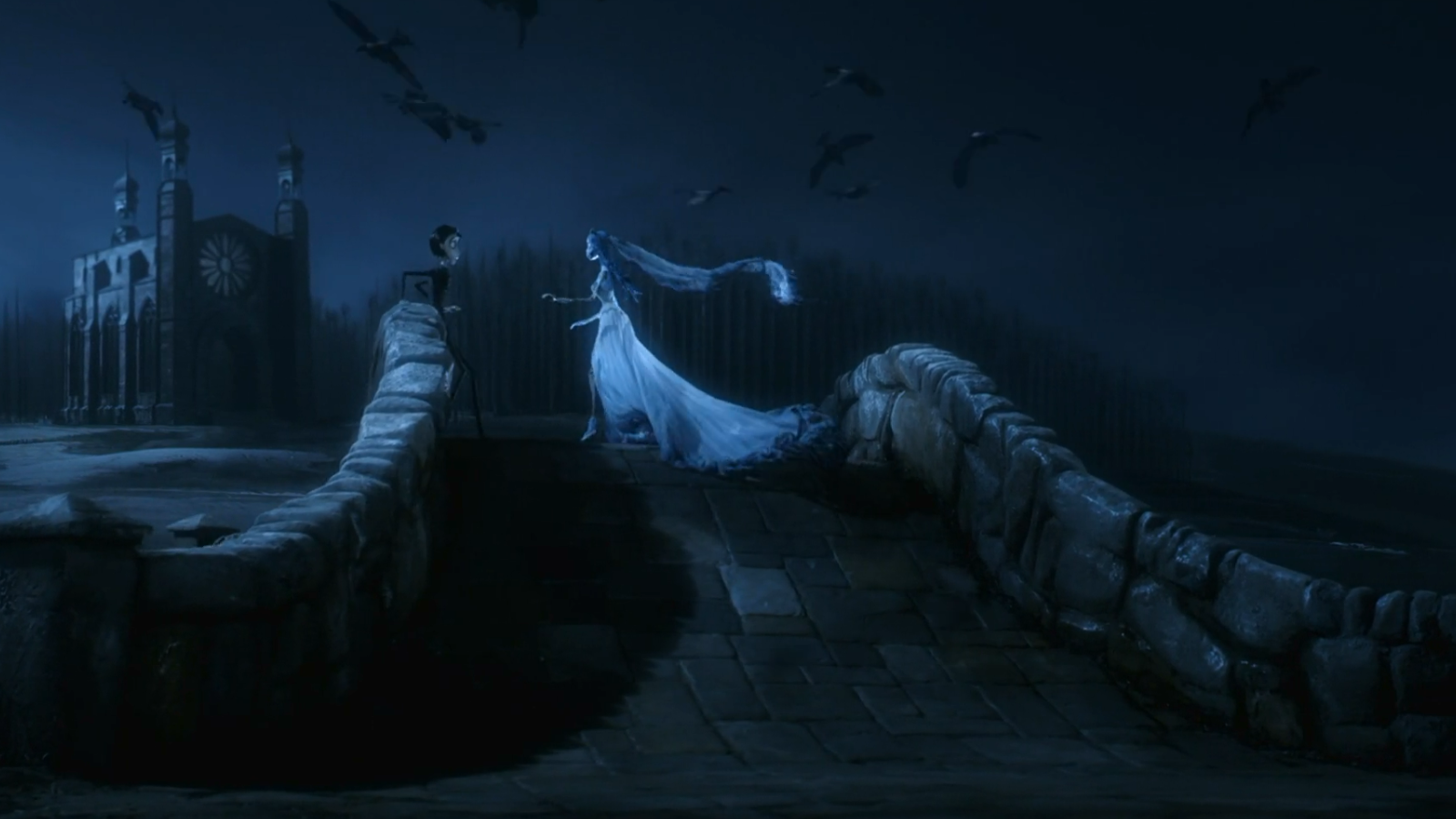 The facial expressions that Emily displays in A Corps Bride are often extremely exaggerated due to her large animated eyes. Emily also has dark circles around her eyes which can symbolise trauma, this could be because of the way she died; murdered by her fiancé. However, when she looks at Victor se smiles brightly, this contrasts her usual sad expression. Emily's posture is good for the majority of the film this displays her affluent past. Victor, however, is a nervous man who is very easily startled. This is displayed as he is often looking to the floor and flinching when he is in the land of the dead. His eyebrows are pointed upwards which gives him a constantly disconcerted look. In the scene I have screenshotted below Emily looks very upset almost angry, her eyebrows are furrowed which is what demonstrates her unpleasant mood. Victor looks as if he is impressed with Emily's ability. His facial expression shows his concern for her and that he wants to sort out the argument that they have had.


I am going to analyse the scene in which the Maitlands drive off the bridge and die. To start off with we are shown a big, white house. The colour and size of the house can demonstrate the couples innocence, immediately you associate the colour white with purity so there seems to be no threat. This juxtaposes the morbid event that is about to take place. After this the shot changes to the couple driving up to a bridge which has a red barn like structure over it. Red symbolises danger so is potentially predicting the tragic even which is about to come. I think that using red as the colour for the barn was extremely effective as it immediately makes the audience aware of the impending threat.
 A small dog runs onto the set and the Maitlands swerve to avoid hitting him, this demonstrated there sweet and caring attitude. The dog was not just randomly placed there as we see him again before the car plummets to the river below, he is the reason the couple dies. The yellow car is also representative of their positive personalities. The red of the barn and the yellow of the car contrast each other one representing anger, blood and death the other representing new life, positivity and hope. The river that they fall into is not just a small stream but a gushing river that makes huge splashes when it is crashes into the reason for this in my opinion is to create a chaotic and dramatic effect.


Beetlejuice is a fast-talking con man. Whenever he is on stage he speaks at 100 mph with absolute enthusiasm, his facial expression match his larger than life personality and are constantly over exaggerated. He uses this as a technique to manipulate people, he only thinks for himself and is only concerned with what helps him. His voice is also low and gritty which emphasizes his sleazy personality. Beetlejuice's voice contrasts Adam and Barbara's as they are fairly well spoken, I would expect there voices to be different from one another as their personalities are completely different. The Maitlands are calm and put together whereas Beetlejuice is chaotic and frantic, this is also represented in the trios body language. Beetlejuice is constantly touching and kissing Adam and Barbara whereas the Maitlands are far more conservative in their actions, they keep their hands to themselves and move more carefully.

Unit 26.2 Old Films for New
Bibliography:
Task 1: Initial Research.

Below is a graph that shows that people would like an online copy:

The production cost for my magazine with slower shipping and 100 copies would altogether be £80.50. This would mean that to make a profit I would have to price my magazine at, at least £1 each if I did this I would make £100 in revenue but only £19.50 profit. I would want to make more profit than £19.50 so I would place my magazine at a higher price. From some initial research I did, I found out that most people would want to pay between £1 and £5. Therefore, I would price my magazine at £3. This would mean that I would make £300 revenue and £219.5 profit for selling 100 copies of my magazine.
I have decided that my magazine will be coming out monthly. This is because it means that I would be able to keep regular buyers engaged by the idea that they will get content often enough that they will stay in the loop of the magazine but they will not be being bombarded with too many copies that they will get bored and no longer want to keep on buying it.
To conclude the main purpose of my anime film magazine is to fill the gap in the UK market and to give an in-depth look into anime and manga style films. I would sell it for £3 as it would make a decent profit as well as being a price that I believe people will be willing to pay. I would distribute it in corner shops as well as book shops to try and reach as wide an audience as possible. It would feature all different genres to be able to satisfy every reader's interest. I want my magazine to be easily accessible hence why I believe an online copy would be a lower cost, more eco-friendly and more convenient option. However, if this was an option that is unavailable I would be able to produce 100 copies of an 8-page magazine for £80.50 using an online website that makes the whole production of a magazine far easier.
Unit 26.1: The Theory Of Films
The director that I am going to focus on is Tim Burton. The reason he is considered an auteur director is that in every single way his films are undeniably done by himself. To be an auteur you must have recurring themes, actors and a very distinct visual style. Tim Burton follows all of these in his films, he almost always uses the same actors,e.g. Johnny Depp, and Helen Bonham Carter. He always uses a darker colour scheme that creates a drab and mysterious effect and his films almost always have a slightly darker theme that uses jokes and songs for comedic relief. Tim Burton was often influenced by Christopher Lee, Alan Moore, and Edward Gorey. All of these people have a sort of dark and mysterious style much like Tim.The first film that I am going to discuss is A Corpse Bride. The genre of this film can be classified as gothic. However, there are some elements of this film that do not fit this genre, this is because there are parts of this film that are more light-hearted even comedic. Songs and dance provide some relief from the main gothic themes.
A corpse bride is set in a small secluded town with an eerie woods very close by. It is set in the Victorian era and has a very lifeless and shabby feel to it. Everything has a dark and decrepit air about it. In the first shot of the trailer, you see Victor running from the woods towards the village. This displays to the audience that these are going to be places that crucial events take place in. For a Corpse Bride, it is a stop motion animation, there for each scene is filmed frame by frame this means that it would take at least one day to film three seconds of footage.
The set is made up of clay forms and plasticine that is modelled to look like a gothic victorian town. Victors costume consists of a black and white suit that has grey accents, he wears a silver tie and has slicked back black hair. Emily wears a tattered light blue/off white wedding dress with a flower crown made up of dead flowers, her hair is long blue and looks unkempt. As this is a stop-motion animation everything is a prop, from the characters to the coffins and the ear worms.
The facial expressions that Emily displays in A Corps Bride are often extremely exaggerated due to her large animated eyes. Emily also has dark circles around her eyes which can symbolise trauma, this could be because of the way she died; murdered by her fiancé. However, when she looks at Victor se smiles brightly, this contrasts her usual sad expression. Emily's posture is good for the majority of the film this displays her affluent past. Victor, however, is a nervous man who is very easily startled. This is displayed as he is often looking to the floor and flinching when he is in the land of the dead. His eyebrows are pointed upwards which gives him a constantly disconcerted look. In the scene I have screenshotted below Emily looks very upset almost angry, her eyebrows are furrowed which is what demonstrates her unpleasant mood. Victor looks as if he is impressed with Emily's ability. His facial expression shows his concern for her and that he wants to sort out the argument that they have had.
The colors consist of dark themes. This symbolises dark and mysterious connotations throughout the film. There is also the use of muted blues and purples within the film and this is symbolic of the themes of depression, death, and transformation. For the main character Emily, she has light blue skin and dark blue hair, this demonstrates she is dead as blue connotes coldness and lifelessness. Moreover, it displays themes loyalty, spirituality, and jealousy which all are shown as very strong characteristics of Emily. However, I think that the light blue can also be a very calming colour which contrasts her fairly chaotic nature. The other hero of the film Victor, has black hair and monochrome clothes this is symbolic of anxious and depressive characteristics. But, I think that Victor should of had some other colors in his costume such as, muted purples and greens. This would be to show his sensitive and soothing personality. Throughout the film and the trailer, there are small pops of bright colors, I think that this is symbolic of the fact that there is light in the darkest of places. These bright colors contrast the dark colour scheme the rest of the film follows.
Overall the lighting in the film is very dark however at points they use high key lighting in order to create an atmosphere. I have noticed that in the film they use three-point lighting system, this is effective because the film needs to maintain its dark aesthetic throughout the whole of the movie. I think that if the film was over lit it would take away the eerie atmosphere that was created. The low lighting provides deep black and contrasts in the film which helps display the gothic theme. In the first scene of the trailer, they keep the lights fairly low however the backlight is very bright. This contrast demonstrates to us that the background is currently more important than the foreground, this is because the light is focussed on the small village in the distance, it shows the watcher of the film that this is going to be a crucial area where main events are going to take place. Furthermore, because the woods that is in the foreground is very darkly lit it symbolises that this is going to be an ominous place that is associated with danger due to the darker colors. This is accompanied by a tune that almost sound like a child's nursery rhyme with the sound of crows in the background. Crows are often seen as bad luck or a symbol of death, this juxtaposes the tune in the background and forebodes that dark things are to come. However, I think that the opening scene of the trailer shows the film in a different light to what it actually is. I believe that it shows the film to be a scary and ominous where as it is actually fairly humorous and light hearted. If they had used slightly less contrast in the advert it would of displayed it in a lighter theme.
Throughout the majority of the trailer, there is a narration that briefly summarise the themes of the film. The narrator's voice is rough yet intriguing, his vocal quality is good throughout his narration. This is important as he is trying to real the watcher in, he wants to give away enough but not too much. The women Victor is engaged to is very well spoken but her voice is soft at the same time this may indicate that she comes from a well off background but also that she is kind-hearted. Victor, however, has a shaky voice when he interacts with people at the beginning of the trailer, towards the end however he has a slightly stronger voice. This can show how Victor's character develops throughout the film and he gains courage towards the end. However, I think the change in Victors voice should of had a more dramatic change in it to make his development more obvious to the audience.
Victor moves rather clumsily, you can see this in the part of the trailer where the practice of the wedding is occurring. He bumps into the table and knocks things over. I believe that this matches his nervous personality and is also symbolises to the watcher that as well as being physically clumsy he may also be clumsy with his words, meaning that what he says may not always come out right.
Later on in the trailer, we the corpse bride (Emily) emerge from the ground. It is a high angled shot in which once more the backlight is very intense. In this shot, the fill lights are slightly brighter which brings the watchers attention on to Emily. The high-key lighting that focuses around Emily gives her a celestial feel which is appropriate as she is the undead. In this shot, there is a high contrast from the light that comes through the windows it makes all the other areas on the wall dark and eerie which adds the mysterious atmosphere that is trying to be achieved. Throughout the film Emily is often shown in high key shots, I think this is in order to emphasise that Emily can be seen as spooky and ghostly. However, Emily is seen to be a kind person by the audience. This is why I think that Emily could of been shown in some softer lighting, it could show her in a more intimate way, this means the audience could of built up more of a relationship with the character.
The movements of the skeletons as the dance is very complicated. Their heads, arms, legs, feet, and mouths are all moving simultaneously, it is effective as it makes the audience forget that they are watching an animation film. Rather then looking like robots being controlled they looking like something that is alive and moving fluently. In this scene, there was also a lot of movement from other people which gives the effect of chaos and pandemonium.
The aim of the editing in this film is to make a stop-animation film look as if it is taking place in real life. In the opening frame, there is also text edited onto the screen to tell you who the actors starring in the film are. To change into the next scene there is a flash that almost simulates the crash of thunder and lightning, this almost predicts the metaphorical storm that is going to come later in the film. Because the film is animated the whole process of creating the film editing. They will take pictures of the models frame by frame and will then proceeds to put the pictures together and play them quickly to make it look like that models are moving on there own.
Throughout the trailer, they use a variety of shots such as extreme close-ups and long shots. One of the extreme close-ups in the trailer that I thought was effective was when they zoom in on Emily's face as her ear worm pops out of her eye. This is a comedic and light-hearted moment, it makes you focus on Emily's facial expression, she is nervously laughing it is something you don't often see from her which makes it a crucial moment. After this, in the trailer, there is a 360-degree camera movement around Victor and Emily. It displays the characters in what seems to be a very intense moment. Emily's veil is flying around them moving in the wind this creates the sinister atmosphere which is what I believe the director wanted to portray.
The second film I am going to discuss is Tim Burton's Beetlejuice. The genre of the film is a combination of comedy, horror and fantasy. You can tell this from the dark coloured scenes with the pops of occasional colours such as purple and green. The fantasy aspect of the genre comes from the other worldly parts of the film, for example, when the main couple cross over to the afterlife as well as the fantasy creatures such as Beetlejuice himself (a demon). The narrative of the film consists of a story that portrays a young straight laced couple (the Maitlands) who die, can not pass over into the afterlife and are not able to leave there home. A new family then proceed to move into their house, they are a hip and bohemian couple from New York with there extremely gothic and alternative daughter (the Deetz). The film demonstrates how the Maitlands end up being far more paternal towards Lydia. Towards the end of the film it shows that all characters can all cohabit in the same house with both the Maitlands and the Deetz's both having crucial parent like roles to play in Lydia's life. Tim Burton follows the auteur theory, this means that he uses reoccurring themes and characteristics through out his films such as using the same actors e.g. Johnny Depp as well as following a similar style which is gothic and the idea that he tackles darker subject matter in an almost comedic way. This is demonstrated in his film Beetlejuice as he takes on the theme of death and demons but displays them in a humorous way as there is multiple musical numbers that help lighten the mood.
Beetlejuice is set in Winter River in 1988, it small and charming village. It has few village stores (one which is owned by the Maitlands) and a church. However after the Maitlands die they find that they can not leave their house, but where they can go is to the afterlife. The afterlife is not what they expected at all. Rather than a tranquil place in the clouds its a dank waiting room with the feel of bureaucratic office block. There is stacks of unorganised papers and ghoulish looking staff slaving away at their desks.


At the beginning of the film there is not really any special effects, but as the film progresses and we are introduced to the afterlife that's when special effects are introduced for example when Barbera and Adam are in the afterlife both of their heads morph into disturbing monsters, (this is a graphical edit). As well as this, when Adam and Barbera step out of there house for the first time after dying they are transported into a different reality which is edited to look as if it is a desert in space. There is also a huge snake like monster that appears from the sand ready to attack. These are all graphical edits as well. I believe that the snake should have been made to look far more spine-chilling then it did, this is because the genre of the film is meant to be partially horror and there are not that many scary moments with in the film.
Beetlejuice is a fast-talking con man. Whenever he is on stage he speaks at 100 mph with absolute enthusiasm, his facial expression match his larger than life personality and are constantly over exaggerated. He uses this as a technique to manipulate people, he only thinks for himself and is only concerned with what helps him. His voice is also low and gritty which emphasizes his sleazy personality. Beetlejuice's voice contrasts Adam and Barbara's as they are fairly well spoken, I would expect there voices to be different from one another as their personalities are completely different. The Maitlands are calm and put together whereas Beetlejuice is chaotic and frantic, this is also represented in the trios body language. Beetlejuice is constantly touching and kissing Adam and Barbara whereas the Maitlands are far more conservative in their actions, they keep their hands to themselves and move more carefully.
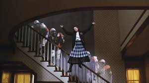
At the end of the film, there is a musical number, it is happy and upbeat in order to represent that the Maitlands and the Deetz can cohabit the same house and live harmoniously. The song is called "Jump in the Line" and the whole family is singing and dancing in it together. There is lots of editing in this last scene as a feature of the house move with the music and Lydia even floats in the air. Not only is the music symbolic of a happy ending but the fact that Lydia is no longer wearing all black but has a navy blue plaid skirt on showing that her character had developed into one that is now less depressed. However, I think that if Tim Burton had decided to dress Lydia in brighter colors; potentially yellow or pink, it would be a more obvious change, as there is a larger contrast from the beginning of the film to the end.
Unit 26.2 Old Films for New
In this report I am going to discuss the differences and similarities between the film Chicago 1927 and its 2002 sequel, as well as talking about their production contexts.
The film I am going to discuss first is the original version of the film, which is an American dramatic-comedy silent film. It was directed by Frank Urson and produced by Cecil B. DeMille. Chicago was also created by Cecil B. DeMille’s production company, as it was an independent film created outside the major film studio system.
The staring roles went to the famous actors, Phillis Haver who played Roxie Hart, Victor Varconi as Amos Hart and Julia Faye as Velma Kelly. As this film was released 92 years ago, I was not able to find a reliable source that said how much the budget was assigned to the film; one result, however, said that the budget was $303,306. I can almost guarantee the budget was much lower than the 2002 remake, seeing as not only was it a silent film but the equipment used to make it would have been of much lower quality and price. Again, as the film is aged, I cannot find what country provided the funding for the film, seeing as it was an American film, that Hollywood created in 1919, I can assume that it was funded for by Hollywood. Chicago was created by Cecil B. DeMille’s production company, it was an independent film as it was created outside the major film studio system.
After some further research, I could not find any information on whether Chicago had any money come to them through funding bodies and I am uncertain that there were funding bodies for films in 1927. In the 1920s, the studio system that was used for filming silent movies was combined with a way of film making that was dominated by a small number of "major" film studios. For the technology aspect when filming a silent movie during this era, I could not find any precise equipment; however, I would assume due to the time period that an Eastman Kodak's 35mm film stock camera was used.
The 1927 version of Chicago was distributed by the same individual who produced the film, Cecil B. DeMille and the posters that were made in to advertise the film were bold and colorful, aesthetics that would capture the audience's interest. Another aspect of context we have to consider would be that cinemas were only invented in 1905, indicating that when Chicago came out, cinemas had only been around for 20 years, and would not have been any of the companies we know and love presently, such as Odeon or VUE. It is far more likely that this film was shown in small local cinemas.
During 1912 - 1932 is when film certificates were first introduced, and they were originally two different certificates. A for adult which means that some children must be accompanied by adults and U for universal meaning that it is suitable for all viewing audiences, but I could not find a certificate rating for Chicago so seeing as they were still a fairly new concept that the film either did not have one or it was rated U. Cecil B. DeMille’s production company only produced four films all together and does not own any cinemas.
I am now going to discuss the 2002 sequel of Chicago. It was once again an American film in the genre of a musical crime - drama, it was directed by Rob Marshall and the film was produced by Martin Richards.
The stars of the film were Renee Zellweger as Roxie Hart, Catherine Zeta-Jones as Velma Kelly and Richard Gere as Billy Flynn. Using big stars such as Renee Zellweger would mean that more people would be inclined to come and watch the film, this means that it is going to make far more money as it draws a bigger audience. Furthermore, people who are super fans of the actors and actresses will be more inclined to watch the film multiple times and potentially even bye merchandise making the film even more money.
The budget was $45 million, which is huge in comparison to the original version. This means that the film was able to have a far more complex set, costume as well as much better technology that would have been used to make the film a much higher quality. Also, a higher budget means that they would have been able to do far more advertising and marketing.
To advertise the film there was trailers released, posters made as well as bill boards, this is far more advertisement than the original version got, this almost grantee that this version is going to be more successful and make more profit than the first simply due to the number of people it was advertised to. The higher budget also means that they were able to hire high-end choreographer as well as vocal coaches, this means that the actual performance in the film was very high quality and extremely enjoyable to watch. This is one of the things that if you are anything like me that constantly draws you back in to watch it again and again.
The funding for the film came from Hollywood seeing as it is an American movie. The production houses that made the film were production circles and it was distributed by Miramax. Chicago was not an international co-production, the USA worked on its own in order to create the film.
This film would be considered a mainstream movie, unlike the original version which was an indie film. Due to the budget of the film being so high at $45 million, there was no need for any external money from funding bodies. The cameras that were used to film the 2002 version of Chicago were American LT, Cooke S4 Lenses and the American ST, Cooke S4 Lenses. The sound equipment that was used were DTS, Dolby Digital and SDDS.
Chicago was released worldwide in over 40 countries and was featured in cinemas such as Odeon and VUE. This means that it was made available to far more people than the first version of Chicago, so therefore it makes sense that it made far more profit than the first film. The certificate that was given is PG 13, I believe this is appropriate as the film is not too extreme but it does involve violent and sexual references. Finally, Production Circles do not own any cinemas nor do they distribute any other films.
Bibliography:
- na. (6/10/2018). Chicago (1927 film). Available: https://en.wikipedia.org/wiki/Chicago_(1927_film)#See_also. Last accessed 13/03/2019.
- Fritz Kamer. (30/03/2014). Chicago (1927) A silent film review - Movies Silently. Available: http://moviessilently.com/2014/03/30/chicago-1927-a-silent-film-review/. Last accessed 13/03/2018.
- na. (22/02/2019). studio system. Available: https://en.wikipedia.org/wiki/Studio_system. Last accessed 13/03/2019
- na. (25/01/19). Movie camera. Available: https://en.wikipedia.org/wiki/Movie_camera. Last accessed 19/03/19.
- na. (14/03/19). History of British Film Certificates. Available: https://en.wikipedia.org/wiki/History_of_British_film_certificates. Last accessed 19/03/2019.
- na. (13/03/2019). Chicago (2002). Available: https://en.wikipedia.org/wiki/Chicago_(2002_film). Last accessed 19/03/2019.
- na. (2002). Chicago (2002) - company credits - IMDb. Available: https://www.imdb.com/title/tt0299658/companycredits. Last accessed 20/03/2019
26.3 Film Production Publicity Pack
Task 1: Initial Research.
Introduction:
- The title of the film Is "The Rocky Horror Picture Show".
- It was released on the 15th of August 1975 and was produced by Lou Adler and Michael White.
- "The Rocky Horror Picture Show" is set in Transylvania and the genre of the film is science fiction parody of B movies from the 1930's up to the early 1960s. As well as being fantasy/mystery.
Producer:
- The producers of "The Rocky Horror Picture Show" are Lou Adler and Michael White. A film producer is someone who oversees film production. They plan as well as coordinate different aspects of the film production
- The producer would want to oversee every aspect of the production of the idea to the distribution because, without any pre-production, it would be extremely difficult to come up with a cohesive idea that was realistic and has targets that are reachable. Furthermore, the producer would need to make sure everyone was following the plan that they have created. This is because people did not have guidance on what to do it would result in a messy and potentially unfinished project. As well as this, the producer wants to create something that they know the audience is going to enjoy. In the end, the aim of the producer is to make the most entertaining movie that the target audience is going to watch over and over again. To do this they must oversee everything to make sure it is to the highest quality possible.
- I could not find any if the research techniques that Lou Adler and Michael White used for The Rocky Horror Picture Show. However, I can suggest some that they may have used. The first one they could have used tests screening. Test screening is the proses of showing the movie to a small audience before it is released to the general public to watch. This is done in order to get feedback on what can be improved before it is released for everyone else to see. Another research technique they could have used are questionnaires. A questionnaire is usually a series of questions given to the general public, that are used to find out opinions and general information on what the target audience think of the film. The final research technique I am going to suggest is focus groups. Focus groups are when a group of people congregates together to discuss and give feedback on something that is yet to be released. They can be used to give feedback on ideas for films.
- I was not able to find out any information on whether Lou Adler and Michael White used these techniques to help improve the production of The Rocky Horror Picture Show. However, if they had, the feedback they would have gotten would have helped to shape the film and potentially of made it more entertaining to watch.
Target Audience:
- The Rocky Horror Picture is seen as a cult classic and has the age restriction of a 15. This is due to its graphics and sexual nature. I believe that the target audience is from around the age of 15 up to 30 years old. This is because it has aspects that all ages can appreciate whether that be the dance routined or the raunchy scenes.
- I was not able to find out any information on how specifically Lou Adler and Michael White targeted the audience or whether the strategies were used effectively, but, due to the success of the film and the live show, I would believe that yes the strategies were effective. The way I think that the audience was targeted was by deciding what the genre and themes were, and then deciding who it was most appropriate to gear it towards. The producers probably saw that a lot of the themes were to do with love, sex and comedy so, therefore, realized that that was a fairly wide range of people they could target it towards. The target audience I believe is most likely is 15-30-year-old women.
- I believe that the target audience was selected correctly. This is because the film ended up being extremely successful grossing almost $113 million, and making almost $479 million in tickets. This means that the target audience must have been selected correctly or it would not have done as well as it did.
Marketing Strategies
- The Rocky Horror Picture Show was advertised through a variety of different mediums. The first one that I am going to discuss is the trailer that was released. It was a 37-second add that summarised quickly the main themes and plots. It opens with the image of large red lips that continue to narrate the rest of the ad. The use of the color red will really grab the audience's attention and draw them in.
 This is the poster that was used to advertise the film. There is a lot of black negative space used in the background, it contrasts the red in the title and the lips. Also, the main character is the center stage of the poster. It makes it very clear who is the main character is as well as who you need to focus on in the film.
 - For the original 1975 film, I could not find any information about red carpet interviews or premier events. However, for the 2016 remake, it premiered in October and interviews with the majority of the cast took place. This would help create a good relationship with the audience because when you find out more information about the film and the characters, it means that you will feel more inclined to come and see the film. Red carpet interviews are usually accompanied by photographers which take pictures of the event. When theses images are posted onto socials media and put into magazines, they help advertise the film further.
- The Music for The Rocky Horror Picture Show was composed by Richard O’Brien and Richard Hartley. The film was directed by Jim Sharman. They would of all had to work together to combine ideas in order to create a successful film. The synergy between all three of the people enabled them to create a film that was unique and very popular.
- For the original 1975 film, there were no websites or production blogs used to help market the film. There wouldn’t have been wide access to websites or computers so there would not be an audience to market to.
How was the film distributed? - The Rocky Horror Picture Show was distributed by 20thCentury Fox.
- The benefits of choosing a major studio like 20thCentury Fox are that there are more resources available for marketing and distribution. As well as this the quality is thought to be higher, there is a level of professionalism expected.
- The film opened in the UK on the 14thof August 1975 in the Ratio Theatre and in the USA on September 26thin the UA Westwood cinema.
- The Rocky Horror Picture Show made 140.2 million USD at the box office. I am not sure whether this exceeded their targets or not as there is not any information on it.
- I believe that marketing and distribution were very effective. This is because still to this day this film attracts groupies and 100s of fans to the live performances as well midnight showings of the film. The film is still considered a cult classic to this day and is something that a wide audience will be able to enjoy for years.
Task 2: The Plan
- Tag Line: "It's no use going back to yesterday because I was a different person then."
- The title: Alice In the Country of Hearts
- Synopsis: Alice stumbles across a small white rabbit. As if under a spell she follows him blindly eventually falling down a rabbit hole. Thrown into a distorted and violent word the rabbit is gone and Alice is alone. Ruled by a ruthless dictator; the Queen of Hearts. Chaos thrives. Alice descends into the mystical and dangerous land. She will meet many disturbed characters along the way including The Mad Hatter. Drawn to him at once she will continue her adventure with him. Somethings not write but she can’t quite remember, ever since she entered this dystopian land her brain has been foggy. The Mad Hatter says that he is a friend and someone she can trust … but there is something sinister about him. When she is with him her memories seem to get worse, failing to remember the world she once came from. Will Alice ever escape this so-called Wonderland?
- Main characters: Alice, Mad Hatter, Queen of Hearts and the White Rabbit.
- Classification: 15. The reason I have chosen the age rating of a 15 for my movies is that there will mature themes and language, however, there will not be a particularly graphic nature to the film, more disturbing and mysterious.
- Intended audience: My intended audience is going to be for both male and females between 15 and 25. They will be people who are interested in dystopias and fantasy.
- The genre of the film is fantasy/mystery.
The majority of the people I asked told me that the film I have created is one they definitely would go and see, they said that it was an interesting concept and a unique take on the classic Alice in Wonderland. Everyone I asked said that it was easy to tell that the genre of my film was mystery and fantasy. This is because on my mood board and poster the imagery is obviously fairly mystical. Most people I asked said that the poster was an effective way to market my film, they told me it was because it shows the main character straight away and it leaves you asking questions due to its elusive nature. My main image is fairly effective, however, some people said that my poster may be slightly too graphic for an audience as young as 15. In order to sort this issue out, I may consider changing the age restriction to 16. Some other feedback I received was that I should have another protagonist in the movie to help Alice. I think that I could bring back the white rabbit from the start of the film, this is because he is a sweet kind character who will be able to help her in her adventures.
My Poster Design:

Task 3 - The Proposal
My Poster Design:
Task 3 - The Proposal
Task 4 - The Evaluation
I think that my audience expects the genre of my film to be fantasy/mystery, one of the reasons I think this is because the poster does not reveal much about the plot, but what it does reveal is the main characters. You can see via the color pattern on their costumes that the film is going be a darker and more mystical one. Furthermore, the background of my poster has oversized mushrooms with hidden patterns within them. I think that this will help demonstrate to my audience that there is going to be elements of fantasy in the film. The color pallet of the background is also very bright and almost psychedelic, it contrasts what is in the foreground of the poster. Because of this, I think that my audience will expect a conflict of interest in the film. My poster automatically introduces some of the main characters from the film. However, for my poster, I have decided to use a stylized drawing of a traditional Alice character. I did this because I want my audience to be intrigued to come and see the movie, it helps build up the expectations for a mystery film. The main theme I believe that the audience will expect from my film is an adventure. I think that this is due to the fact that in my synopsis of the film it speaks of a journey that Alice has to go on as well as a ruthless dictator. Most people would see this as an opportunity for an intense fight scene full of action and passion. Also, the journey has the potential for meeting new characters as well as other enemies that have situations the heroines must overcome.
The most important emotional response I want my audience to feel is curiosity. Throughout the whole film, I want them to be thinking that they are solving the mystery alongside Alice, I want this film to challenge my audience. I want the film to be extremely immersive, so if Alice feels scared the audience should feel terrified. I also want my audience to have a sympathetic response to the Mad Hatters character. This is because it is going to be obvious that his mental and physical health is going to be deteriorating while film commences. The audience will not know why until the end of the film so I hope that another one of there emotional response will be one of suspense. This will also be something that will be felt throughout my whole film, as one of the genres is mystery.
I belive that my promtinal pack is an effective preview of the content that is going to be in my film. This is because the poster I have created is integuing and shows the style of my film. By placing imfamous charecters on the front and using a brightly coloured patterned background it demonstrates to the target audience that it is going to be a fun film to watch. Futhermore, my synopsis of the film gives enough detail away that it shows people what the main themes are, without giving away to much so that they feel like they need to go watch the film to see what happens next. The inspiration boards hels induce the preffered emotinol effect of my film idea. It has a very mystical and adventurous feel to it, with lots of colors, costumes and meis en scene ideas. Everything on the inspiration board is weird and wonderful which will help the audience feel exsited to watch the film. The final element of my promntinal pack I am going to discuss is my story board. The story board demonstartes what shots and camera angles I use and what they mean, as well the setting and meis en scene. All of this together helps craete an effective image of what my film is going to look like.
My target audience suggested that my orginal age rating for the film (15) may be slightly to low due to the slightly graphic image of Alice on the front of the poster. I took this into consideration and because of some of the potentailly more complex theems of the film, such as mental health, I would raise the age rating to a 16. They also suggested that another protagnist should be there to help Alice on her adventures. I thought this was a good idea, so I have included the chesire cat (that you can see on the poster) and the white rabbit who is a sweet and kin charecter who can help her. However, they also told me that they thought they would definatley want to see it and that it was a unique take on an original classic. Personally for my film I may re consider who was to direct it, this is because I belive that I desire Tim Burtons directing style over David Yates. Tim burton is an Arteau director that uses the actors that I would like to be in the film as well as being able to create dark and mysterious films in the style I want for Alice in the Country of Heatrts. Futhermore, I may create another poster that demonstrates more of the darker themes of the film, something with a less brightly coloured background and using more muted tones. This would be more effective as the bright color wont miss lead the audience into thinking that the film may be sutible for children.
Bibliography
na. (2019). the Rocky Horror Picture Show. Available: https://en.wikipedia.org/wiki/The_Rocky_Horror_Picture_Show. Last accessed na
https://www.flipkart.com/athah-anime-alice-wonderland-white-rabbit-13-19-inches-wall-poster-matte-finish-paper-print/p/itmf9hehdvxkphth
51R-77tCB+L.jpg
https://www.dailymail.co.uk/tvshowbiz/article-1252091/Alices-weird-wonderland-Why-scenes-row-Tim-Burtons-fantastical-film-disappear-cinemas-fast-Cheshire-Cat.html
https://www.dailymail.co.uk/tvshowbiz/article-1252091/Alices-weird-wonderland-Why-scenes-row-Tim-Burtons-fantastical-film-disappear-cinemas-fast-Cheshire-Cat.html
https://annie17.wordpress.com/2013/03/08/idea-research/
video-scenes-alice-wonderland-s-32061
https://www.youtube.com/watch?v=QdCMDRrGO50
https://www.cinemablend.com/new/Behind-Scenes-Looks-Concept-Art-Alice-Wonderland-16643.html
video-scenes-alice-wonderland-s-32061
https://www.youtube.com/watch?v=QdCMDRrGO50
https://www.cinemablend.com/new/Behind-Scenes-Looks-Concept-Art-Alice-Wonderland-16643.html
https://www.telegraph.co.uk/culture/theatre/dance/11285774/Behind-the-scenes-of-the-Royal-Ballets-Alices-Adventures-in-Wonderland.html
https://www.sydneyprops.com.au/event-theme-hire/top-themes/alice-in-wonderland?p=5
https://www.pinterest.co.uk/pin/453034043751564454/
https://www.pinterest.co.uk/pin/504966176939595561/
https://www.instructables.com/id/Giant-Mushrooms/
https://www.pinterest.co.uk/pin/488288784593145246/
alice-in-wonderland-prom-dress
https://www.etsy.com/sg-en/listing/289600941/alice-in-wonderland-wedding-dress-winter
https://www.pinterest.co.uk/pin/234116880607777219/
https://www.ejumpcut.org/archive/jc54.2012/MarstonWhWomenRace/2.html
https://www.hemswell-antiques.com/antiques/watches/half-hunter-cased-18ct-gold-pocket-watch-60429.html
na . (2019). Paramount Pictures. Available: https://en.wikipedia.org/wiki/Paramount_Pictures. Last accessed 15/05/19.
No comments:
Post a Comment